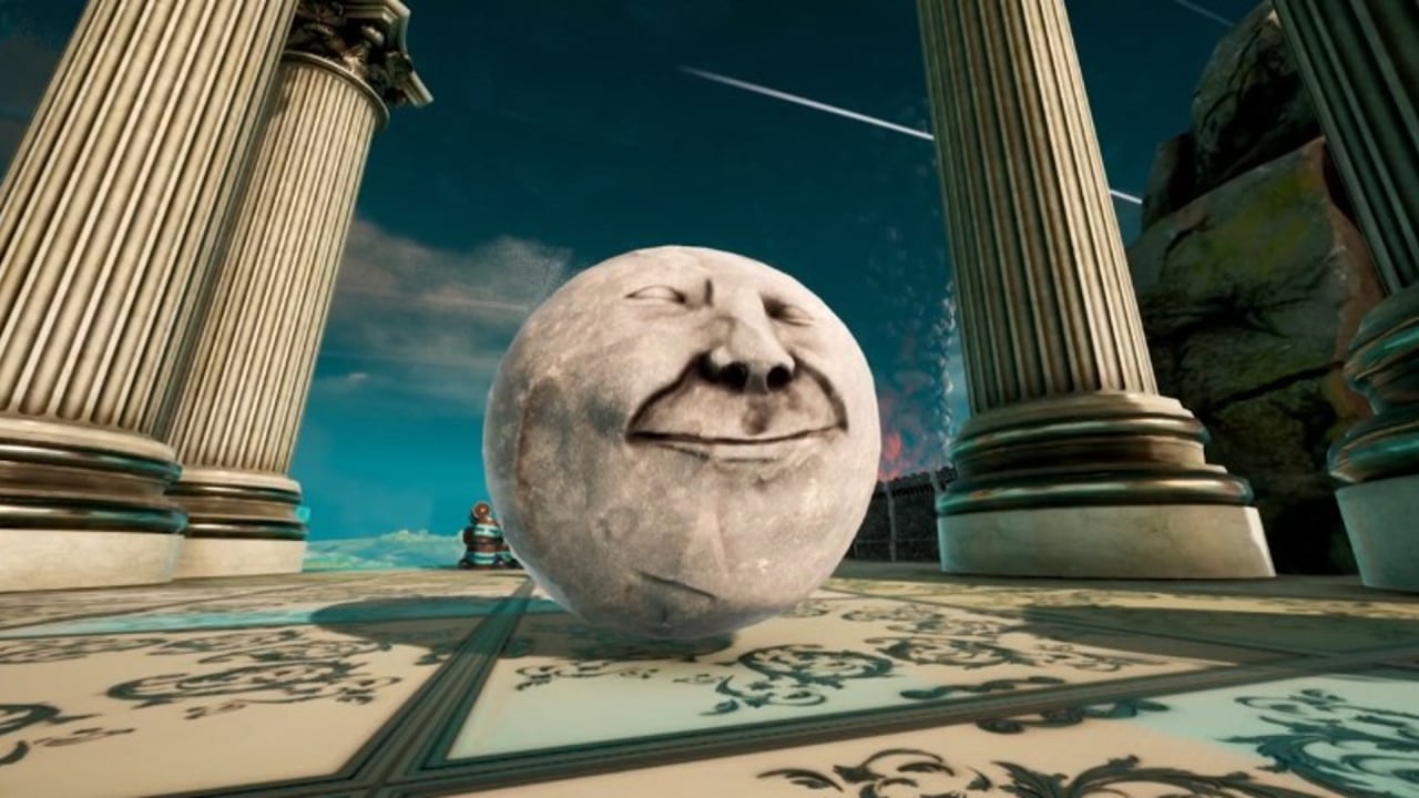
Some games just aren’t a good fit for the Switch. It’s a sad truth, but a truth nonetheless. Rock Of Ages 3: Make & Break falls into that category, we’re sorry to say. The most egregious problem to be found in this Nintendo Switch incarnation is, quite simply, a lack of suitability to the handheld format.
It’s the text. There’s plenty of it here, and it’s all entirely too small. We found it almost unreadable even in docked mode, but undocked? Eyestrain city. Forget it. We checked the menus to see if it could be increased in size, but as far as we could tell, there’s no such option (unless it’s there but written even smaller, invisible to the naked eye).
That’s just the HUD, tutorials and objectives, of course. You could muddle through without them, if the actual game were fun enough to make that an appealing proposition. Sadly, it isn’t, and – again – a large part of that is down to the ill-fitting nature of the thing. What do you do in Rock of Ages 3: Make & Break? Ultimately, it’s a bizarre combination of Super Monkey Ball-esque obstacle courses with a relatively rudimentary tower defence component, and neither element is satisfactory.
Let’s talk about the presentation; in a word, it’s exhausting. It’s got a Terry Gilliam-style Monty Python cut-out kind of vibe that’s certainly unique, but ultimately compounded our frustration with the game by being a little charmless. The cutscenes in the “Break” mode (effectively its campaign – we’ll talk about “Make” a little later) might have been pleasant if we knew they would be followed by a solid video game, but as it stands they’re just wearying reminders that not only are we still playing Rock of Ages 3, but we’re not even really interacting with it.
The rock-rolling sections of the game run well enough, but aren’t particularly fun. Weaving around the courses in order to cross the finish line first requires speed, but even the earliest stages have deceptive corners and feel designed to trick you into careening your rock over a cliff, effectively removing any chance of your finishing the stage in time.
It’s tricky to balance your speed with your manoeuvrability, and sure – that’s the game. But it’s more frustrating than anything, with hazards all over the tracks feeling arbitrarily placed and designed to irritate. There are plenty of variants and modes (time trials, for example) in this campaign, but none of them really solve the game’s problems. It can occasionally be momentarily exhilarating when you successfully navigate a particularly fraught path, but it’s just leading to more of the same.
The tower defence component feels like an odd match, but here it is. It’s often a pretty rudimentary take on the genre, with you building your indeterminate-looking defences to prevent enemy rocks from reaching your castle, then challenging the enemy’s course in the more standard rolling mode. We found it a very awkward slice of gameplay indeed, with it being pretty unclear how to even get started.
There’s a tutorial, sure, but it’s not very extensive. Eventually, we figured it out through trial and error, and we’re disappointed to report that this didn’t make the proceedings any more enjoyable. The graphics here are so muddy, it’s a challenge just to figure out what’s going on. Fussy controls make putting together your defences a chore at almost all times, too. Again, there are different variations on the basic tower defence theme, but not one of them is without these same frustrations.
It’s not just “Break”, of course, there’s also “Make”; effectively, a powerful and relatively easy-to-use level editor that lets you share your creations with other players online. It serves its purpose but said purpose is creating new stages for a game that isn’t very much fun. We don’t think it’s going to set the world on fire, exactly, but credit where it’s due; the editor is surprisingly versatile and friendly. You can jump into your levels and test them quickly and easily, but – again – we’re not sure why you’d want to. Still, if you find yourself enjoying Rock of Ages 3, this at least guarantees a way to access a theoretically unlimited reservoir of stages – as long as the servers stay up.
Graphically we found the game samey, unimpressive, and often blurry. The visual design – while not to our personal taste – deserves praise for delivering something different, but it’s all just so self-consciously “quirky” that we couldn’t help but find it irritating. The music is rather good, with strong arrangements of classic music. One of the said arrangements is a version of Mozart’s Rondo alla Turca, which just made us wonder if we’d ever be seeing Lemmings on the Switch.
Conclusion
Rock of Ages 3 failed to impress us on almost any level. It’s definitely a game with character, and it could feasibly work its charms on you, but in its drive to be different and unusual it seems to have neglected to be fun. Still, it certainly has an audience; broadly speaking, you don’t get to a second sequel without your game mattering to someone. If you can muscle through the frustrations, you might be able to roll with Rock of Ages 3, but with so many other worthy titles on Switch, we can’t say we’d recommend it.
