Welcome back, one and all, to the latest edition of Box Art Brawl. After a week-long hiatus to charge our hadouken, we’re returning with another bout featuring regional box art variants battling for your pleasure (and votes).
Last time we took a look at Paper Mario: The Thousand-Year Door in a particularly close-run duel between East and West. Ultimately, Japan that emerged victorious from that bout with 58% of your vote. The European / North American variant came away with a bloodied nose, then, but it can still hold its head high. Good game, good game.
This week we’re back with a three-way bout as Natsume’s NES side-scroller Shadow of the Ninja takes on its deadliest foes and dances around not one, but two of its own shadows. Released in Japan in August 1990, this co-op action game is available to play on Switch for anyone with a Nintendo Switch Online subscription, so check it out if it’s a new one on you.
Let’s see how the game with three names holds up thirty years on…
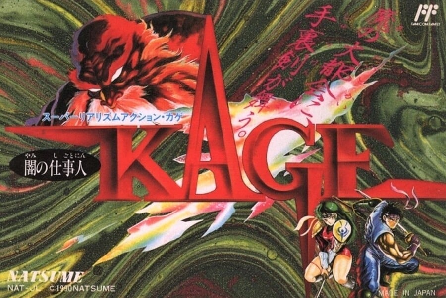
Japan

Known in Japan as KAGE or Darkness Worker Kage, the ninja protagonists Kaede and Hayate feature in the bottom right against a swirling green mass in the background. The red-hued ‘KAGE’ logo, styled and embossed with red blade-like lettering, takes up the majority of the landscape-oriented Famicom cover, with the intimidating white-eyed chap in the opposite upper left corner to the heroes.
We enjoy the sharp lettering of the title, but otherwise it’s all a bit messy and hard to pick out individual elements on this cover.
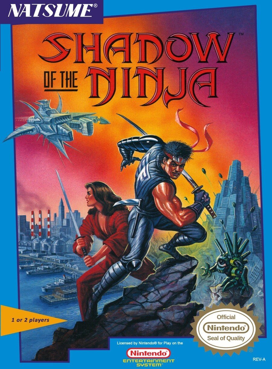
North America

The North American version again features curved, blade-like stylings in its logo, with the retitled Shadow of the Ninja in red again. The protagonists take centre stage this time, with Kaede adopting a very similar stance to the Japanese cover as they battle against robotic enemies in a retro-futuristic cityscape. It certainly gives you a better idea of what to expect from the game.
The fiery orange and red background brings to mind the Ninja Gaiden cover, and the off-kilter border gives the whole thing a shifting, unpredictable nature; it keeps your eye from getting comfortable and has you cycling around the image looking at different elements.
The logo could be a little bolder, perhaps, but we like this a lot. Plenty to chew on.
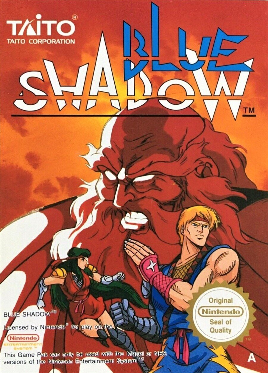
Europe

Kaede and Hayate are interpreted a little differently on the European cover, as if Axel and Blaze from Streets of Rage were on their way to a fancy dress party. The white-eyed, red-skinned, beardy guy (Emperor Garuda, we presume) is the star of the show here, and we like the heat of the colours on this cover.
Retitled Blue Dragon in Europe, we’re torn on the logo. It almost looks like someone started with a shark stencil and carved away the negative space around the letters, adding a strikethrough line for good measure. The less we think about it, the more we like it (yes, that definitely makes sense!), and the logo of European publishers Taito is always a winner.
So, three very different covers, but which one is the best? Pick your favourite from the options below and hit ‘Vote’ to let us know:
That’s all for this week, folks! Thanks for voting and we’ll see you next time for another round.
